By Emily Rushton
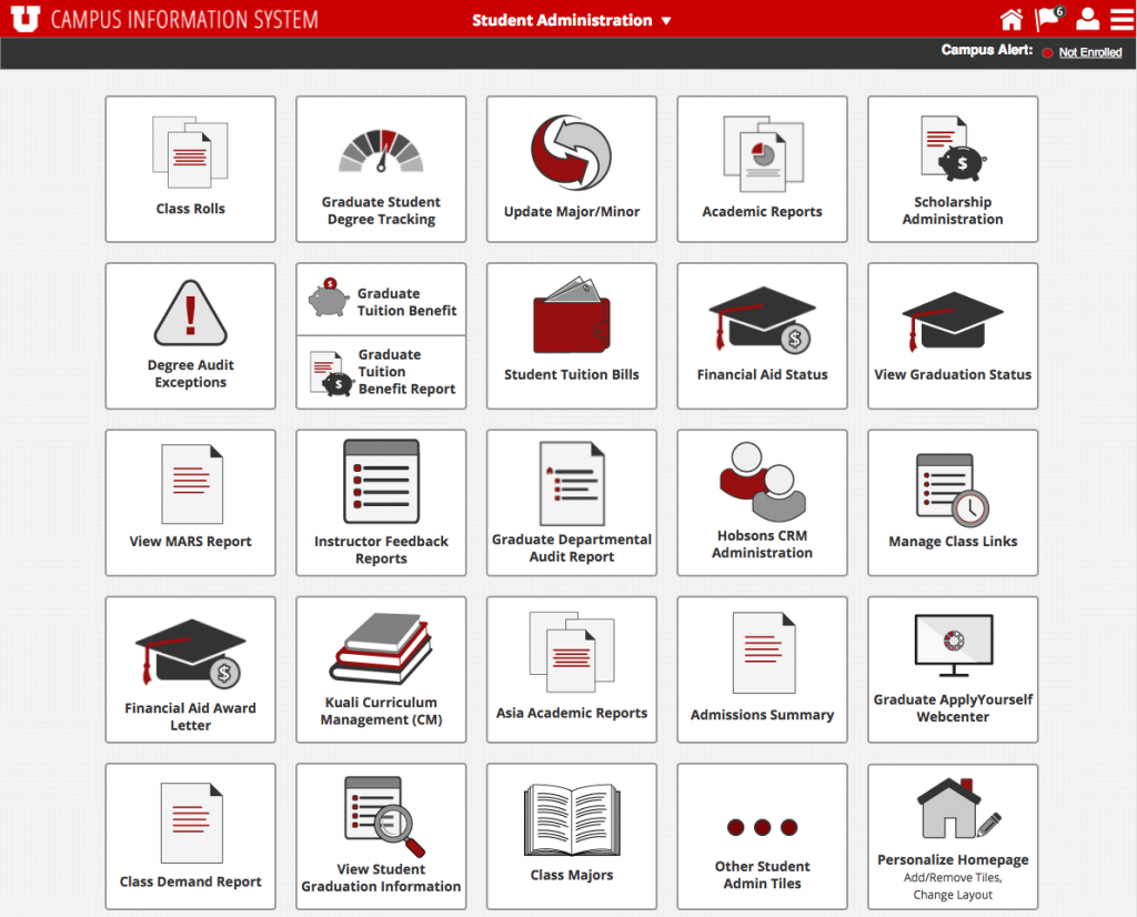
Campus Information Services (CIS), the online application you use to access everything from your paycheck to your class schedule is finally getting a new look. CIS hasn’t been redesigned since 2003, and doesn’t align with today’s design standards. It can be difficult to use, is visually cluttered with numerous links displayed regardless of applicability to the user and is non-responsive for mobile devices. A redesign was inevitable, and a big goal with the redesign is to reduce the number of links a user sees on his or her homepage.
“Over the last nine months, we’ve been using Google Analytics to track the link usage in the current CIS portal,” said Mark Curtz, product manager overseeing the redesign. “We’re using that data in our new design to position the most-used applications and resources so that they’re easier to find.”
“We’ll be organizing [links] on home pages,” added Curtz. “We’ll be able to consolidate redundancies and give the CIS portal a modern, mobile-friendly user interface.”
Links will display on individual tiles with intuitive icons, rather than a long, text-only list. The home pages and subsequent tiles will be dedicated to user roles, functional areas and common themes. For example, in addition to the student and employee pages, the new CIS will offer a “Financial Services” page with links to finance applications, a “Faculty and Research” page with links to resources for professors and principal investigators, and a “University Resources” page with links to applications and services common to all campus users (e.g. Marriott Library, Campus Map or Shuttle Tracker).
“We’re using the same [Google Analytics] data to identify infrequently-used links that can be optional,” said Curtz. This means users will have the ability to add or remove those link tiles on any of their existing pages. Users will also be able to create their own custom home pages with the links they use most.
“The new streamlined interface, combined with the flexibility for users to customize their pages, will make the CIS portal much easier to use,” said Curtz.
The brand-new CIS will be revealed to all students, faculty and staff on June 10, 2017. Stay tuned for more updates as the go-live date gets closer.
[bs_row class=”row”]
[bs_col class=”col-sm-6″]
 [/bs_col]
[bs_col class=”col-sm-6″] [/bs_col]
[/bs_row]